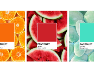
Pantone is a company that known to be the world-renowned authority on color and provider of color systems and leading technology for the selection and accurate communication of color across a variety of industries. Specializing in colors, Pantone holds annual events to determine and plan what the most popular color of the year will be. Most consumers base Pantone’s Color of the Year announcement on their housing renovation decisions and etc. Pantone defines the Color of the Year as “a symbolic color selection; a color snapshot of what we see taking place in our culture that serves as an expression of a mood and an attitude”.
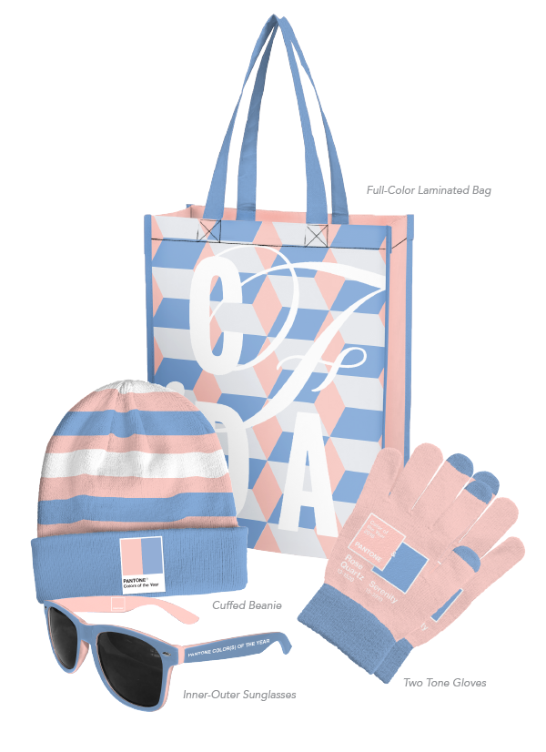
2016’s Color of the Year was a first of two colors: Rose Quartz and Serenity. The gentle color of Rose Quartz is supposed to represent compassion and composure, while the relaxing color of Serenity is supposed to represent a weightless and airy vibe.
Now that you are ahead of 2016’s trend, theme your promotional products with Pantone’s official declared colors of the Color of the Year. Captiv8 will abide by Pantone’s color and color pairings to make your product perfect for 2016’s trends.
